Showing posts with label background image. Show all posts

Sunday, December 02, 2012

iWork Book on Twitter Page Background.

This is the new design for the background of my Twitter page at iworkinpages

It has my book on it and the photo of the famous apple which I've use in the graphic panel of the title of this blog and its favicon (small icon next to the internet address.)

The apple variety is called Winter Banana. My book, with a free sample chapter, is available on Packt Publishing here and on all major book-selling websites.


Wednesday, September 26, 2012

How to make text stand out on difficult background.

Putting text over background images or simply on photos can be complicated when there are different colours and textures in the image. Parts of text can get completely lost.

To make the text stand out, put it in a Text Box, then go to Graphic Inspector and choose Fill > Color Fill. When Colours Inspector (Viewer) opens, choose a colour that does not radically contrast with the colours of the image, but is similar.

In Graphic Inspector, drag the Opacity slider to around 50 percent. Remember: you should be changing the opacity of the fill colour, not of the text. The colour fill becomes semi-transparent, allowing the text to be clear and sharp, but with the background image still visible.

Here is how it works with a macro photo I took the other day. It shows a greenish lichen on the mostly grey trunk of a rowan tree. (See my other photos on The Rendezvous Photo Journal).

Before:


After:

The grey used for colour fill here is the Silver from the box of Crayons in Colors Inspector with opacity set at 50 percent.


Tuesday, February 07, 2012

Backgrounds: using Musical Poster template.


In this post I want to show 
- how elements from iWork templates can be used in our own designs 
- and how to combine multi-column layout with text boxes and graphic images.

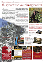
The background for this magazine page (picture on the right) with a historical theme is from the Musical Poster template. 

Background from Musical Poster

Open it with File>New From Template Chooser

The image of a yellowed piece of paper in the background is locked, you cannot select it. 

To unlock, Arrange>Unlock. When the image shows handles, copy it and paste into your document. (picture at bottom left). 

Then resize to fit your design, send to back or move to background, also under Arrange menu. You can rotate it by dragging the handles while pressing Command and change proportions: uncheck 'Constrain proportions' in Metrics Inspector and drag handles to resize. 

When the poster image is in the background you can arrange other elements of the page on top of it. To avoid accidentally moving the background image, choose Arrange>Make Backround Objects Unselectable.


The images here are screenshots, actual PDFs will have a high definition suitable for high-end professional printing.

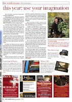
Note that the magazine page has a combination of one, four and three column formats for text.

Next, I'll show how to use a combination of layout and text boxes to design pages like that. 

You can subscribe to I Work in Pages, or follow me on Twitter, Facebook and Google+. 


Tuesday, September 06, 2011

How to Frame a Picture.

Pixellated frame

I've written a few times about designing cards on this blog, including a 10-step tutorial which includes finding clipart, making original shapes and using simple tricks with photos.

Here I just want to add a little word of caution: if your card is meant to be printed out and especially if you expect a high print quality, don't use picture frames provided in Graphics Inspector. (This is in response to a reader's question: he designed a book in Pages, but used picture frames from the selection in Graphics inspector)

They look nice on screen and even in print when used in small dimensions. But if you enlarge the image you'd see that the frame pixellates badly (small squares - pixels - show).

To avoid that make your own high-definition 'frame':

Coloured shape behind image.
– create a shape, eg. rectangle with solid colour fill, and slide your photo (image) over the created shape, adjust dimensions so that it looks as though the image is within a frame (pic. left). For additional effect, add a white rectangle between the picture and the coloured shape (pic. below right). This also improves the print quality, because the intense colour of the shape may affect the colours of the picture.
Coloured shape, white, then picture.


– instead of a coloured shape use a photo – take a macro shot of your wooden chopping board, or the garden table, or gravel, sand or thick foliage. Here (pic.below) I've used a picture of a beech hedge in winter.


– on the internet you may find high-resolution images of museum paintings with elaborate carved frames. Download the image, import it into your Pages document and cover the painting with your own picture while leaving the frame visible.

Slide white shape over 'frame', picture over white.


Image: 'Sappho', a fresco from Pompeii.

Sunday, August 07, 2011

Background Photos: Everywhere

Rather than looking for background photos on the internet, it's better to build your own library of backgrounds. At least you know what you normally want, so can choose and collect pictures as you go.

Go where? Everywhere! If you don't have a digital camera, use the one on your mobile, these days most have one. I sometimes stop in the middle of a town market to take a few snaps of the pavement, or go up to a building and do a macro close-up of a stone wall. Meadows, fields, sky, beach – backgrounds are everywhere. People sometimes stare, but who cares.

Here is a lichen-covered wall of the 11th Century Bayeux cathedral in France. I was in town having lunch with friends and thought that it would make a good background. So here you are, the wall:


And here it is in the background. To make text stand out better I put it in a Text Box with colour-fill and reduced opacity to 50 percent.


Saturday, July 02, 2011

Background Images


I am publishing this wonderful photo of a meadow in full bloom in France (photo by ©Francesca Bostock, 2011) just to show how to use background images.

What is attractive about this photograph is that it has a natural colour sequence: look how deep green, light green, speckled yellow, scarlet red, orange-red, deep blue and light blue is spread throughout the expanse of the meadow. And the curving road at the top adds a pefect finishing touch. Nature is the best artist.

Now, drop the photo into your Pages document, then under Arrange menu Send it to Back or Send Object to Background. After that create a Shape (a text box, or a rectangle) and in Graphic Inspector choose colour fill, pick colour (here it is a shade of green, but grey would work well too) and reduce opacity to around 75 percent, then type and format your text – an invitation to the Fourth of July barbecue, to la Bastille fireworks or to the Remembrance ceremony (image on the right).

One semi-transparent box
If you think the text doesn't stand out enough, use the two box trick (image below): insert a second shape, make it larger than the shape with text and Send Backward under Arrange menu. Then reduce opacity to around 75 percent.

Next select the box with text, in Graphic Inspector click on colour well and when  Colour viewer opens increase opacity to 100 percent. Using two boxes instead of one gives the impression of transparency while in fact the main box has solid colour fill to allow the text to be clearly visible.


Read more in the articles How to make coloured text stand out on the same colour background and Fading Out a Background Image.

See more photos of Normandy on my photo blog.

Wednesday, August 04, 2010

Fading Out Background Image (an example)

Read about a different technique: 
putting text on semi-opaque background in this article: 

How to make coloured text stand out on the same colour background.


Here is an example of how fading out the background image helps to make text stand out better.

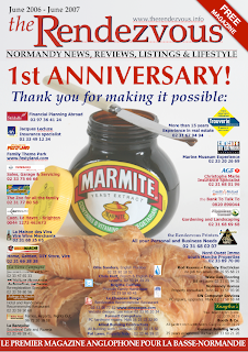
For the first anniversary of my magazine I designed a full page advertisement. I removed the straplines off the cover of the first issue of the magazine and arranged logos and small text ads from our regular advertisers and partners over the main cover photo (read this previous post with some other tips). Even though the original picture has off-white background allowing to put a lot of text (straplines) onto it, fading out the photo made text and logos more clearly visible and the old front page of the magazine 'stands back' to accentuate the thank you message to supporters.

Use Opacity slider
'Send to Back' function is under Arrange menu. Current versions of Pages also have more powerful options of Sending Object to Background and making it unselectable, so you can carry on working without the risk of accidentally moving the background image. 

To fade out the image move Opacity slider at the bottom of the Graphics inspector to a lower percentage count. Here the marmite image is set at 85 percent.


Putting an image (object) in the background and fading it out can have other uses:

- colour background: make a shape in your Pages document, give it colour fill of your choice, resize so it covers the whole page - and send it to background; 

- watermark effect: take your logo (or any image), enlarge it, fade out to between 40 and 60 percent - and send to background; 

- theme page effect: take festive images (fireworks etc.), moody landscapes, old black and white photos or clip art fade and send to back to give pages devoted to a particualr theme a unifying effect; (read Remembrance Theme: Using Background Images)
- colour coding: give your magazine or brochure coloured margins by 'bleeding' images or coloured shapes (positioning them to overlap the margins of the page), so that when the publication is closed you can see coloured sections in it;
- branding (repeated theme) effect: when you are developing an image to become associated with you or your business, a logo for example, you may want to place it repeatedly on your stationery, on pages of your brochures and catalogues. Fading out the image could help this marketing technique be less obtrusive, but without losing efficiency.

The original picture of a Marmite jar and croissants, to symbolise the blending of English and French cultures, was made by the famous Fleet Street photographer Mike Forster, design concept by Miranda Ingram.

Thursday, May 20, 2010

Cover Tricks: Making Text Stand Out


This is the cover of the Property Guide I produced in Pages (64 pp., A5 format).

The cover was made by my co-worker in Illustrator, processed to press quality PDF and then incorporated in the Pages project.

The cover photo poses serious challenge to a designer. With mixed background of blue sky and foliage, various shades of green and brown, and long shadows of a low-hanging sun, how do you put cover straplines in such a way that the text stands out from the background? Here the designer used two tricks: putting white text on the semi-opaque colour box (bottom left) and using white outlines with dark text.

The first can be easily done in Pages and the second, specific to Illustrator, also can be replicated with good results.

I will write up the how-to in the next posts, but meanwhile if you have suggestions or comments, do contact me. And if you would like to have a copy of the guide send me an email.


Original design by Shu Milne Creative
Pictured: Manoir d'Herouville (Bed and Breakfast) and Le Pigeonnier (gîte)

Saturday, April 18, 2009

Designing D-Day Map in Pages. Part Two

Note: see the finished map and read Part One of this article here


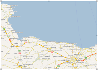
THE FIRST STEP is to find a relevant map and make a cut-out of the area you are going to use in your project.

Scan the map from a book, atlas or take it off the internet, Google maps for example. One simple way of doing this is to make a screenshot: Command+Shift and type 4. The cursor turns into crosshairs. Drag it over the area and let go, after a camera shutter sounds you get a .png graphic file on the Desktop. Import it into your Pages document.

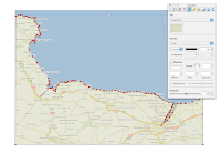
NEXT STEP is similar to working with tracing paper. You need to cover your map with a custom shape. Click on Shapes in the toolbar and slide down to Draw tool. The cursor changes into a fountain pen tip. Each click of the 'pen' leaves a red dot in the document, the consecutive dots are connected to each other and as you continue clicking they form an outline of the map, the seashore for example. At this stage it can be done roughly, just to create the shape. Later the shape of the map can be edited: each dot you leave while creating the custom shape can be moved in editing mode.

The custom shape will have default wrapping, colour fill and stroke (frame). It is better to uncheck 'object causes wrap' in Wrap Inspector for the main shape as well as for all the next objects and text boxes, so that text on the map is not affected by wrapping.

In Graphic Inspector change colour fill and colour and thickness of stroke. You may want to choose 'no fill' to see the map under the custom shape, or, as I did, change opacity of the colour fill to about 50 percent (see picture below left). That way you get a feel of what your own original map will look like, but also see the cutout map area you are tracing.


When the custom shape is finished roughly, edit it to follow exactly the contours of the cutout. Click on the shape, pause and click again. The red dots will show. Click on a red dot and it changes into a circle. This can be moved with cursor or with keyboard arrows. 'Snap to grid' function can be annoying at this stage as the circles will try to align themselves with other objects. To disable this function press Command as you start moving the dots.

To show the sea on the map, insert a rectangular shape, in Graphic Inspector choose a sea-like colour and resize the shape to fit with the right angles at the bottom of the map. Then under Arrange menu Send to Back.

After fine tuning the custom shape you are ready to add other map elements. Please come back to read my next posts.

Read how to add and edit arrows to the map here.


Read more in my new book 'iWork for Mac OSX Cookbook' (2012)
Follow me on Twitter at iworkinpages  
Like my page I Work in Pages on Facebook 
and add me to your circles on Google+ 

Tuesday, December 09, 2008

Сhristmas graphics and clipart: a few easy tricks


Do a Google search for Christmas clipart - and it returns over a million results. Many images are free to download and use, some are for sale. But there are many simple tricks to create your own original clipart or ad a festive theme to your projects.

Here are a few of my favourites:
1. Use your own photos as background images.

2. Create panoramic photo strips

3. Use elements from Pages templates


4. Create graphic elements from the Character Pallette


5. Create your own clip art.


1. Use your own photos as background images for festive theme.

Here I put a narrow vertical mask on the photo of a snow covered fir tree on a sunny Winter day in my garden. Then added a picture frame with blurred edges (Object Inspector - Picture Frame - bottom left option) and put this graphic element on the outside margins of a double page magazine spread. If there is text or other graphic elements over the background photo, fade it to around 80 percent (reduce Opacity in Graphic Inspector). Read a more detailed description of this method in this previous article.

To see the original picture click here


2. Create panoramic photo strip.

- Choose your photo, import into the Pages project and duplicate (once or more).
- Flip second photo horizontally (in Metrics Inspector)
- Align the photos so that they look like one continuous image. Here I used the edges of the glass shelves for aligning. You may need to move photos backwards and forwards to achieve a perfect fit (this option is under Arrange menu).
- Put masks on all photos and adjust the Mask height dimensions to be the same for all photos. Vertical coordinates (distance from the top edge of the page) should also be exactly the same for all masked photos in the strip.
Now you have a perfect panoramic shot.
- Next put a text box over the image and type your heading.
Photo was made in Café du Théatre, Vire, Normandy with Nikon Coolpix 8.1 megapixel camera.

3. There are many graphic images in iWork/Pages templates

They can be used to add a holiday theme. Here I used a photo of champagne glasses from the Catalogue template. Choose Image Fill in Object Inspector and pick the photo. Set Image Fill to Scale to fill. One advantage of using Image Fill-Scale to fill is that the photo automatically adjusts itself to fill the object as you resize it. Here I just dragged down the bottom edge of the box to fill whatever space was available. You may find Image Fill easier to work with than Masking.

4. Create graphic images from characters in the Palette

There are several snowflakes and stars in the Character Palette>Miscellaneous Symbols (if you don't see the palette in your screen menu, go to System Preferences>International>Input Menu and check the Character Palette box to activate it). Characters from the Palette behave like ordinary letters. To make them into graphic elements choose colour as you would for text, enlarge as needed and take a screenshot to get a PNG file. (Screenshot: press Command+Shift and type 4, drag crosshairs over the characters and release)


You may want to remove white background with Instant Alpha (under Format menu) if your graphics go onto a coloured background. (as with the Holly twig in the box at the top)

5. Create your own clipart.

Read how to here and here.

And read more about clipart for Pages here

Sunday, November 30, 2008

Simple tricks with photos: linked contents


Here is a list of links to articles about working with photos in Pages. All the tricks are easy to master with just the basic knowledge of how Pages work. The rest, as Albert Einstein said, is imagination.

Drag and Drop Direct from Mail
Preview Drawer trick: a quick way to select and import photos into Pages
Picasso's room: Simple drawings with photos, edited shapes and curved lines
Use Preview to update repeated formats

The Hughes Family templates: how to make collages and mosaics with photos
Happy New Year 2009! Drawing letters and images in Pages
Christmas graphics and clipart: a few easy tricks
How to change background in a photo
Remembrance theme: using background images
Obama, Blues Brothers and Picasso - yes, we can
How to separate people in the photo from the background
Remembrance poppies: make your own clipart
When picture wrapping pushes caption out of the text box
How to download photos
Blue conversions: a solution
Rose Cover: simple tricks with photos
Simple tricks with photos: fading from side to side
Fading out background image
Extracting photos back from Pages documents
No fuss with resizing pictures: use image fill

The list is updated as new posts are published.
Please come back to check out new tips and tricks.

Friday, November 28, 2008

How to change background in a photo


It's a popular graphic design trick. You take a picture of a person, remove background and put the person in front, for example, of a famous landmark.

While Pages is not a specialised graphic design programme, a few simple tricks can help you achieve striking graphic effects.

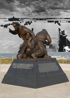
Here is a photo of the new American monument in Normandy, recently unveiled at Utah Beach. The US Naval Order raised thousands of dollars to create this moving memorial to the sailors who fought to liberate Europe from nazis and the French provided the land. Surprisingly, while there are dozens of memorials to American soldiers in Normandy, the Navy had none. Photo of the unveiling ceremony below left.

I used Instant Alpha to remove the sky and put in a real documentary photo of American forces landing at Utah Beach on D-Day in 1944. The black and white photo is masked and the mask is set to have the same width as the main photo.

Please read these previous articles about some other simple tricks with photos:
How to separate people in photo from background
Remembrance theme: using background images

To see the original photo please click here

Sunday, November 09, 2008

Remembrance theme: using background images

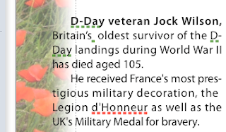
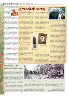
The photo of red poppies lining a Normandy field is used here to create a graphic margin for the Remembrance page in our magazine. The image is one of a series of photos I took this Summer.


Here is how it works:

- Import original photo with poppies (top right image).
- Under Arrange menu - Send to Back.
Now the photo is behind all other elements of the page.
- In Metrics Inspector click on rotation wheel or on degrees arrows to rotate the photo so that the line of red poppies is vertical.
You can also rotate the photo by pressing Command and dragging the photo's handles (little squares in the corners).
- Resize and move the photo so that the vertical line of poppies is on the margin of the page.
- Mask and edit mask so that the right side of the image slighlty, only just, overlaps the text. (top left image)
- In Object Inspector (update: Graphics Inspector in current version of Pages) add picture frame with blurred edges.
In my version of Pages it is the bottom left option. Blurred edges create romantic, moving feeling about the whole graphic composition.
- Reduce opacity of the image (also in Object Inspector).
Fading out the background image by reducing its opacity is needed to avoid a large graphic element dominating the page and also, because it overlaps the text in the first column, to make the text visible.

The whole process may sound complicated, but in fact it is rather easy to do - and very enjoyable. The things you do for England!

I was slightly concerned about the slanted line of horizon visible at the top, but then realized that, serendipitously, I gave the photo a 'fallen soldier' effect - you fall down and the earth and the sky look tilted in your eyes.

Whenever you use a photo as the background image always consider reducing opacity. I think it is the best way to achieve better visibility for text and other graphic elements 'in front'. Of course, light, consistently coloured images may not need this. Like the 'old parchment' image behind the main article on this page. The image itself is from the Musical Concert Poster template which comes with your copy of Pages.

Note: Click on pictures to see small details

Please also read these related articles on I Work in Pages:

Remembrance poppies: make your own clipart in Pages
Simple tricks with photos: fading photos from side to side
Fading out background image

and see other photos of red poppies in Normandy on our Readers' Photos blog here and here
If you use the photos please credit them to the Rendezvous Media.

Tuesday, August 21, 2007

Fading Out Background Image in Pages


20 aug 07

Fading out the background image is a simple trick to make superimposed text or graphics stand out better. I notice it is not frequently used or mentioned by Pages users.

It is often difficult to find a photo suitable for superimposing text and other images. Colours are not contrasting enough, or part of the text disappears merging with the background. So it is simply too much hassle when the job could be simply done by putting text into solid colour boxes separate from the picture.

Which is a shame because if you succeed in making the background image work it immediately makes your page look so much classier.

I have been working with the same professional photographer and the same graphic designer for over a year now. So by now they know what I want and prepare visual material for me bearing in mind the textual requirements of the page. Where they know I would be putting my text they take care to have uncluttered and evenly coloured background - sand, blue water, grey-white sky or dark foliage. Studio backgrounds don't work as nicely, they reduce the naturalness of the composition.

Still it may be quite a struggle at times. And that's where 'fading' out helps.

I was designing a full page composite advertisement for my magazine where dozens of different logos and slogans had to be fitted around the central image.

I sent the main photo to the back under Arrange menu and played with it adjusting Opacity in the Object Inspector. At 85% the background image was faded but clearly visible and the logos and text on top of it stood out better.

I recommend this simple trick to all Pages users - it gives results as good as in Illustrator or Photoshop, but is far easier to master.

Addendum: read more tips and see illustrations in this later post.
Related Posts Plugin for WordPress, Blogger...

Copyright

© 2006-2010, 2010-2017 Alexander Anichkin, All Rights Reserved.
All content is original and was created by me, the author and publisher of I Work in Pages.
Quotations and images are attributed where applicable.
No republication without express prior permission.
Blog template by Blogger with customisation by the publisher.