Showing posts with label Apple iWork Pages PDF. Show all posts

Wednesday, September 19, 2012

Vector. Don't panic.


Here is another of my short reassuring notes for those iWork users, who don't have specialised technical knowledge (which they may not need, anyway).

If you go on an internet forum for help, get bombarded by stern technical questions from the regulars waiting for fresh meat, you can get confused instead of enlightened. Don't.

When you hear about vector graphics that are not mentioned in iWork manuals or help articles, don't panic or despair. PDFs, that iWork is perfectly capable of producing, is as good a vector image as any other. So, ignore vector and concentrate on PDF. The point about vector graphics is that they can be resized without losing crispness. This is usually all you need to know.

Here's a short excerpt from the Wikipedia article on PDFs:

A PDF file is often a combination of vector graphics, text, and bitmap graphics. The basic types of content in a PDF are:
  • text stored as content streams (i.e., not text)
  • vector graphics for illustrations and designs that consist of shapes and lines
  • raster graphics for photographs and other types of image
In later PDF revisions, a PDF document can also support links (inside document or web page), forms, JavaScript (initially available as plugin for Acrobat 3.0), or any other types of embedded contents that can be handled using plug-ins.
...
Two PDF files that look similar on a computer screen may be of very different sizes. For example, a high resolution raster image takes more space than a low resolution one. Typically higher resolution is needed for printing documents than for displaying them on screen. Other things that may increase the size of a file is embedding full fonts, especially for Asiatic scripts, and storing text as graphics.
Read more on Wikipedia about vector graphics here.

Sunday, August 19, 2012

Common PDF export problems in iWork/Pages


A reader writes:

I've made several scientific posters in Pages '09 and now want to share them with colleagues for feedback via PDF files. I have found that no matter how I export them (print to PS then save as PDF, or direct export to PDF, or print to PDF), some images become really poor quality and some Pages features (like shadows and frames around images) are missing in the PS or PDF versions. I suspect the image quality may have to do with the fact that I'm working with images people sent me already imported in a powerpoint file (and for the final versions I would obtain the original images), but the issue of dropping some of the Pages specific formatting seems strange. Any ideas? - Wendi

Wendy, hi,

- First of all check the quality of the original images without any iWork/Pages features. Open them in Preview and check info. Good quality images should have DPI of 300 or above in real dimensions. A small image may have 300 DPI but when you enlarge it the count may drop.

- Assuming you use Acrobat for producing PDFs, check Acrobat settings for PDF, you may have to change them to a higher setting.

- Some of the picture frames in Graphic Inspector (the ones that look like old-fashioned photo album frames) just don't work at high resolution in large dimensions. But if you want to achieve a similar effect in high resolution, create your own frames as objects using the Draw tool or find a high resolution photo of a framed picture/painting and put your image inside the frame by superimposing your image and adjusting dimensions of your image to fit inside the frame.

- Shadows have given me a lot of headache too. When I use them I make sure that any text in the document is well removed away from the shadow, otherwise it comes out fuzzed on PDFs.

Saturday, February 04, 2012

When a PDF 'Scales Down', Truncates or Appears with a White Band of Empty Space

Here is a curious problem that hits iWork users occasionally. A reader of this blog, Carles, wrote to me a few days ago: 
I am trying to create a magazine. I am using Pages in spite of everybody telling me to use InDesign. Pages is easy and gives the documents a unique look. The printer asked me for a pdf in cmyk. I use Pages '09. I followed all of your instructions and read all the comments. I created a PS and then I processed it through the Distiller. But a white band appeared around the document. I tried to change the sizes but it didn't work. Here you can see the screen shot: (Editor: see picture of the PDF, black lines indicate margins of the document after processing). I don't know what to do.


That looked familiar. I had this problem with my magazine and couldn't find a solution for some time.


This is how to tackle it.


1. First of all, if you have other documents or a multi-page document like a brochure or a magazine, check if the same thing happens to all the pages. In my magazine, out of 32 pages two or three suddenly started producing PDFs that 'scaled down' – appeared smaller, truncated with a white band of empty space around a section of the PDF.

If other documents appear ok, then there is some bug hiding in the document – a code, a corrupt font, something else that you don't even realise is there. 

To get rid of it, create a new document from scratch reproducing or copy-pasting the elements of your design in the new document. Process via Distiller and see if the problem is gone. 

2. Try making PDFs at each stage of designing your document. Create a coloured shape and make a PDF, import the photo – and make a PDF, type in text - and make a PDF. Check at what stage this 'scaling down' occurs. 

In my case it was a corrupt font. I deleted it from the Font Library and then reinstalled a fresh file with the same font. 

3. If this doesn't help, try using someone else's Distiller, the printers' for example, to see if the problem is with your version (or copy) of Distiller.

4. And of course the simplest solution is to crop your PDF as it came out. Cut out the white band and only leave your document. Acrobat has a Crop Document tool. 

5. And another trick: import your PDF with the white band into a new blank Pages document, resize it so that it fills the whole page, with the white band outside of the document, and produce a new PDF from that document. That's what one of my printers did when I had this problem. I gave up and just took the 'scaled down' PDFs to them - they 'scaled it up' without reprocessing or doing anything else to it.

Read this earlier post from 2007 about a different problem with corrupt fonts.


Carles posted his question as a comment on From Pages to CMYK PDF article, his image is used with permission.

Saturday, December 18, 2010

Custom Dimensions: Remember to Change Settings in Preview

Pages and Preview show
the same set of Paper Size options
Problems with setting custom dimensions in Pages projects  seem to be quite common. 


I’ve suggested one way of dealing with it in a previous post ‘How to Set Custom Dimensions for Pages Document’,  but it doesn’t seem to work if you don’t have ‘Adobe PDF printer’ in your print options. Here is what happens with a reader’s project: 
‘ My file is 17 x 11, for a full folded brochure. I created the custom size. When I open in Preview form PostScript it cuts my file directly in half, so I only see the left side. I don't have Adobe. I did try your suggestion. Adobe Reader is installed and in My Applications, and on my dock. But when I try print it does not appear in the drop-down. I did try to save as PostScript again, and dragged to preview just as you said to see if it worked, and it did not. Any ideas on why Adobe PDF does not show up even after installing it? Vicki’

I think I spotted where the problem is: changing the document dimensions in Preview too, not just in Pages. 
Let's forget the Adobe side of this for now and only deal with dimensions.
  
In Preview, open any document, for example your clipped brochure, go to File>Print Page Setup (see picture on the left). When Dialogue opens, click on Paper Size drop-down menu and choose your custom size 17x11, which you have already created in Pages and added to custom sizes in your Pages document (see previous article). Click ok and close the document. Then drag the PostScript file of the brochure onto Preview icon and it should open as a PDF with correct dimensions. 
Now, this PDF will not be press-ready CMYK file, but printers who use digital process may not require CMYK separation and still take it into work, and even those who use larger off-set presses may take your PS file to convert to CMYK themselves, perhaps with an additional charge.  (see this previous article on why the PostScript stage is important when you work with professional printshops).
You'll have to shop around where you are to see what's available. From my experience it's best to work with smaller printshops where you can talk face to face with someone who would understand your needs and the process you have used in creating your document. 

It's important to think through your production process and decide where your work stops and others take over and not to try to go where additional specialised knowledge and skills are needed. There is nothing wrong or demeaning with division of labour, it has existed for as long as we, humans, have been on this planet, not just since the first version of Pages was released.

Update: 

Several readers have asked me additional questions about setting dimensions and 'clipped' pdfs.  General advice: use Preview to check that your document is going to come out in the right dimensions. Open the print dialogue and click on the Preview button. 

And the picture is in reply to Lauren's questions (see comments). The screenshot is of the print dialogue, showing how to scale a large document to fit into a smaller paper format: click on 'Scale to fit paper size.'


Thursday, October 28, 2010

How to Set Custom Dimensions for Pages Document

Several readers wrote to me recently asking how to set custom dimensions for a Pages document. Custom meaning dimensions not available in Page Setup options (A4, B5 etc.)


(If you don't have 'Adobe PDF Printer' in your printing  options please read this follow-up article on using just Preview)  

Let’s say you design a card 11” wide by 6” high for commercial printing. Here is how to do it:


- click Page Setup in Document Inspector (or go to Page Setup from File menu);

- in ‘Format for’ choose Adobe PDF and in Paper Size drop-down menu choose Manage Custom Sizes;

- Custom Page Sizes dialogue opens;

- at the bottom of the left column click plus sign to create new page format with dimensions of your card;

- double click 'untitled' to name it, say 'Doug's Card';

- then, on the right, type in your dimensions 11" wide x 6" high (mine are set in cm, but it doesn't matter);

- set margins the way you want them to be, but remember to allow 3 mm (0.12") for printer's crop, click OK;


- now, in Page Setup dialogue, make sure that in Paper Size drop-down menu, 'Doug's Card' is selected and click OK. Your Pages document should change to the format you've created;

- next, process your card from Pages to CMYK PDF via Postscript, but DO NOT click Landscape in Page Setup, your dimensions will be preserved in the new PDF document.

Monday, April 19, 2010

Why CMYK PDFs are darker than Pages documents?

Chris Howard, a reader from California, wrote to me:

'I've followed the steps in your blog about converting Pages to high quality PDFs.  Does your work come out a little darker when converting to CMYK?  I'm also in pages 09'

Yes, it does a bit. It is not something to worry about, the print quality will still be good.

I am sure those who studied printing techniques in depth will have a better explanation, but for myself I've developed a simple  way of understanding this. RGB colours (red, green and blue) are for the generated screen light going straight into your eyes, and CMYK colours (cyan, magenta, yellow and black/key) are for the light reflected off the paper - that's how the human eye sees them. You have a desktop lamp, look at the things on your desk - that's reflected light. Now look straight at the lamp. Which is brighter?

It is good to keep this in mind when working on your Pages project: use lighter photos and adjust or avoid vibrant, 'neon' colours that look great on screen, but come out dull on paper.

Check this earlier article on converting Pages projects to CMYK-ready PDFs.
Photo: apple buds ready for spring blossom, © A.Anichkin, 2010

Sunday, January 17, 2010

Putting together a book in Pages

Mihail Stelios asks if it is possible to make a book in Pages.

Of course you can make a book in Pages. I have been producing a magazine and guides of up to 64 pages.

There are many things to consider. I think the main one is to plan thoroughly all stages of your work.

Here are a few pointers:

- start with deciding on the format (A4 or A5? or custom size? portrait or landscape orientation?), check dimensions with printers if you are going to print the book professionally. Normally, you add 3 mm all around to allow for printers' edge cutting. Calculate margins carefully allowing more space if the book is going to be bound. Set dimensions in a Pages document and save it to duplicate for all other pages of the book.

- calculate production costs, including packaging and delivery. Weight of paper and type of binding (stapled, ring or hard spine) affect the final cost and quality. Heavy paper allows for better quality, but may put your publication into a higher postal tariff bracket. Lighter paper saves on cost, but may make images show through paper on adjacent pages which would upset artists or advertisers. Check with printers and ask for quotes and look at samples. Don't be afraid to ask 'unprofessionally' sounding questions. Nobody knows everything in full detail.

- decide how you are going to deliver finished pages to printers. Most take PDFs, many are happy to bundle them themselves, some will ask you to do it. Make sure you have the software to convert Pages to press quality PDF (e.g. Adobe Acrobat) and check the settings with your printers. In my experience it is best to establish physical, face-to-face contact with printers you are going to work with. But if this is not practical, test run sending large files via File Transfer Protocol programmes, such as Zipper of SendIt.

- make a 'map' of your book. Put all pages as boxes on one page or on a double page and mark what goes where. Then print it out or keep the file in the Dock or in the side panel of an open window to have quick access to it. Mark finished pages as you go, it will save a lot of hassle later.

- make sure all files/pages are clearly named (e.g. page number, what's on it) and don't change them until the work is finished. It's very easy to loose track of where you are on each particular page. Make folders for each stage in work - e.g. 1 draft, 2 draft, 1 proofs, 2 proofs, printers proofs etc. and move pages from one folder to the next only when the work is finished.

- break all work into manageable chunks: front page/cover, back page/cover, contents, index, sections, don't work in large files. It is best to work page by page, or on two facing pages. However, if your book is one continuous body of text, e.g. a novel, pre-edit and pre-proof it BEFORE breaking into chunks for layout. Read more in 'Editing Large Texts' article.

- first design two facing pages of the main body of the book and then use them as templates for the rest. Pay special attention to small design elements - lines, clipart, page headers and footers. They should be the same, in exactly the same position on the page throughout the book. Metrics Inspector allows fixing co-ordinates down to a fraction of a millimetre. Remember that repeating lines, boxes, clipart are used to align pages when the finished work is bundled for the printing presses.

- use one, maximum two fonts for all of the book. For headings, sub-headings and notes use font variations, not different font.

- don't rush to finish, check finished work at least three times for typos and other mistakes, such as page numbers. Contents and index pages are especially important - page number in Contents must correspond to the page in the body of the book. It may seem obvious, but that's where mistakes often occur. It's worth checking the whole finished work for just one element - for instance page  numbers: go through the whole book to make sure you haven't lost any pages or haven't repeated page numbers. Then take another element,  for instance, font size of headings, and check that it is the same throughout the book. Then, check co-ordinates of lines, logos or clipart in headers or footers. They must be the same throughout the book too. This may seem unimportant, but if style is not consistent it creates an impression of sloppy, unprofessional product. 

- make sure you know and understand certain rules that are used in particular types of publications. For example, if you work on an arts catalogue, you should know that descriptions of  works of art follow a particular set of rules. Take a catalogue of a reputable fine arts firm and follow the pattern - for example, first, title (bold), then name of the artist (regular), date of the work, media (italics), position of author's signature (semi-bold), notes (light, smaller font size), provenance (regular font, but indented). Suggested price/deposit etc.

Have a look at Books in iPhoto on your Mac, you may get good design ideas from there - or even decide to make a book in iPhoto. I haven't used it myself, but have friends who have. The results are very good, but the costs are high, so it's only worth using for special occasions - family book, gift etc.


Check other articles on this blog under Press quality PDFs and professional printing (in the side-bar)

Thursday, August 20, 2009

A logo in PNG comes out fuzzy: what can we do?


Check the following:

- Size of the file (logo) in KB and its DPI count. Most images on the internet have low sizes (30-50 KB) which helps fast loading. These small sizes come out blurry in print even when the DPI (or pixel) count is 300, the standard DPI count for professional printing. To achieve good print quality you need a chunky file of 400-500 KB at least. See if you can get the logo in larger KB size from whoever made it originally.

If not try processing the PNG file via Distiller separately BEFORE importing the image into the Pages document. Then import the logo in PDF. PDFs are crisper and retain image quality better then other types of files when you resize images. You can check DPI count in Acrobart or in Preview under Tools menu or press Command+i.

- Downsize PNG image (e.g.from 4x4 to 2x2) and Distill it in that size. Then try increasing the size of PDF (from 2x2 to 4x4)

- Shadows. Check if your PNG image has shadows. Pages sometimes struggle with shadows producing blurred effect. If you can, remove shadows altogether, or increase the Wrap count around the logo to the largest possible, it may help.

- Check Distiller settings. DPI count is the most important setting - it should not be below be 300. The settings I give in this previous article have provided me with consistently good results.

Thursday, January 08, 2009

iWork 09 released


Apple announced on Tuesday the release of 2009 version of iWork.

The thrust of new features seems to be towards making iWork, including Pages, the word processing and layout part of iWork suite, easier to share, including over the internet.

iWork seems to move steadily into the mainstream

- There is enhanced interoperability of Pages with Word. Pages documents can be emailed in Word format straight from the onscreen menu. And Word documents can be opened - and edited - in Pages. The same applies to other applications in iWork. It remains to be seen how seamlessly this interoperability will work. There have been issues before, with formatting being lost or changed. However, the direction Apple has taken with iWork seems to move this software steadily into the mainstream of office applications.

- Word count is now displayed at the bottom of a document, similar to MS Word. In the 08 version word count is in Document Inspector or submenu.

- A new trial service, iWork.com, is introduced to allow team-working on Pages documents over the internet.

- There are about 40 new templates bringing the total to over 180. Elements of templates can, of course, be used as clip art.

- Mail merge in Pages now works with Numbers, the spreadsheet application of iWork.

- Charts created in Numbers can be linked into Pages and Keynote, the presentation programme. Updating charts in Numbers is reflected in Pages and Keynote documents.

iWork ’09 is available now for 79 dollars/euros. There is also a Mac Box Set coming later in January. It includes iWork ’09, iLife ’09 and OS Leopard - for 169 dollars/euros, which saves about $/€118 compared to standalone prices.

Wednesday, December 10, 2008

Three easy ways to email Pages in non-iWork format

Note: this is an excerpt from a previous article on this blog.

There are several ways of sending Pages documents as email attachments. However, your correspondent should also have iWork/Pages. In many cases it makes more sense to send out Pages in non-iWork format.

Try these three easy ways of sending out Pages:

1. MAIL PDF
- command+P to open print dialogue window. Click on PDF in the bottom left corner. Choose Mail Pdf. Your Pages document automatically converts to PDF format of a mailable size and attaches to a new email message. Fill in the address and message, send. This option is preferable if your correspondent is to make comments to the document. Acrobat allows making comments on PDF documents.

2. MAIL JPEG
- open print dialogue window, click on PDF and choose Save PDF to iPhoto. Your Pages document converts to JPEG format. Then, in iPhoto click on the Mail icon and send out your JPEG. iPhoto has an option of reducing the JPEG file for fast loading.

3. PNG SCREENSHOTS.
It's a quick and fun way of sending out smaller Pages documents or documents in work, because screenshots show guides, invisibles and open Inspectors. The keyboard shortcut to make a screenshot is Command+Shift and hit 4. Cursor turns into crosshairs, drag it to select the area for a screenshot, let go of the mouse (a no-buttons macmouse) and, after a camera shutter sounds, you get a PNG file on your desktop.

If you want a screenshot of just one particular open window, document, Inspector or open folder, press Command+Shift, type 4 and then hit the Space Bar. Move the cursor over the window (it will highlight) and click to get the screenshot in PNG format.

The ease of sharing files in a networked environment is one of the main considerations for businesses and offices when they choose a productivity suite - with a word processor, presentation and spreadsheet programmes. With low cost, striking templates, ease of use and full integration with other applications which come preinstalled on Macs, iWork may be an attractive choice.

Please read other related articles on this blog:
How to send iWork Pages as email attachments
Sending out Pages documents
Quick JPEGs straight from Pages

and an overview of how teamwork can be organised around iWork/Pages:
Sharing and teamwork in iWork/Pages

Thursday, November 20, 2008

...if I don't have Distiller


The only reliable way I know to produce high quality CMYK separated PDFs from Pages is to process documents through PostScript to Acrobat Distiller.

So, what if I don't have Distiller? Numerous readers of this blog have asked me this question. I asked it myself when I was looking at Pages three years ago. I am still not aware of another way to produce CMYK separated PDFs without Distiller.

I can suggest a workaround though:

- if you need CMYK PDFs for a one-off, occasional project save your Pages document to PostScript, put it on a USB stick, CD or similar and take the PS files to a friend with full Acrobat Pro suite which includes Distiller. A computer service/shop or a small professional printer may do the distilling and colour separation from PS files for you for a reasonable fee;

However:
- if your project is of a continuous, long term nature - periodical print publication, posters, cards etc., my advice would be - get yourself full professional Acrobat/Distiller suite. I've just looked it up on Amazon - Pro version 9 could be as low as 200 dollars. When I did costings for my magazine I found that even after upgrading my Mac to Tiger, installing additional RAM (Pages are very RAM hungry!) and buying Acrobat Pro, I'd spend about half of what I'd have to, had I chosen InDesign or Quark.

And the ease of learning Pages, their elegance and intuitive behavior are a big factor too.

Nevertheless I agree with those who complain that there is a missing link between Pages and professional printing. Export to PDF or 'printing' to PDF with Preview is only good for small series digital printing, but not for bigger printshops which require four colour separation.

To read other articles on producing professional print quality PDFs from Pages please click here: Pages and professional printing on this blog.

Tuesday, November 18, 2008

Three easy ways to send Pages as email attachments


1. ZIP - compress to .zip
2. DMG - as disc image
3. STUFFIT - compress through Stuffit

1. To save your Pages document in .zip format just resave it typing .zip after the name of the file, but before the .pages extension, if it is not hidden. Choose Save as... from the file menu (or use the keyboard shortcut: Command+Shift+S) and when the dialogue window opens, type .zip.

2. To create a disc image (.dmg) file out of a Pages document, resave in the same way as above, but type .dmg after the name of the file.

3. To stuff your Pages document, launch StuffIt and drag your file over the programme's icon.

After doing this simple operation you can attach your Pages document as you would with files created in other programmes.

You may find that the first two options are more attractive, if you have to email Pages documents often, because StuffIt is a paid for application.

And, of course, all this only makes sense if your correspondent also has iWork/Pages to open your document.

If not, try these three easy ways of sending out Pages documents in non-iWork formats:
1. MAIL PDF - command+P to open print dialogue window. Click on PDF in the bottom left corner. Choose Mail Pdf. Your Pages document automatically converts to PDF format of a mailable size and attaches to a new email message. Fill in the address and message, send. This option is preferable if your correspondent is to make comments to the document. Acrobat allows making comments on PDF documents.

2. MAIL JPEG - open print dialogue window, click on PDF and choose Save PDF to iPhoto. Your Pages document converts to JPEG format. Then, in iPhoto click on the Mail icon and send out your JPEG. iPhoto has an option of reducing the JPEG file for fast loading.

3. PNG SCREENSHOTS. A quick and fun way of sending out smaller Pages documents or documents in work, because screenshots show guides, invisibles and open Inspectors. The keyboard shortcut to make a screenshot is Command+Shift and hit 4. Cursor turns into crosshairs, drag it to select the area for a screenshot, let go of the mouse (a no-buttons macmouse) and, after a camera shutter sounds, you get a PNG file on your desktop.

If you want a screenshot of just one particular open window, document, Inspector or open folder, press Command+Shift, type 4 and then hit the Space Bar. Move the cursor over the window (it will highlight) and click to get the screenshot in PNG format.

The ease of sharing files in a networked environment is one of the main considerations for businesses and offices when they choose a productivity suite - with a word processor, presentation and spreadsheet programmes. With low cost, striking templates, ease of use and full integration with other applications which come preinstalled on Macs, iWork may be an attractive choice.

Please check these other articles on I Work in Pages:
How to send iWork Pages as mail attachments
Sending out Pages documents
Quick JPEGs straight from Pages

Sharing and teamwork in iWork/Pages

Friday, August 29, 2008

From Pages to CMYK PDFs


The key here is to use the PostScript stage when converting Pages documents to PDF. Simple Export to PDF will not work with professional printers who use CMYK (four colour) separation.
- 'Print' Pages to PS
- launch Acrobat Distiller and process your PS files through Distiller


Acrobat Distiller has several settings. Choose Press Quality or Prepress, whichever settings are available in your version of Acrobat. Here is a summary of my settings which have given me consistently good results for over a year now:

- Under General set Resolution to 2400 dots per inch;
- Under Images set Sampling off and resolution for color and grayscale to 300 pixels per inch and 1200 pixels for monochrome;
- Under Color: Settings file none, Color management policies: set to 'Convert All Colors to CMYK';
- Under Fonts: check Embed all fonts checkbox.

These should give you CMYK ready PDFs and keep your printer happy.

If you regularly use the same printer, I strongly suggest that you arrange a session with them to synchronise all your settings. It's easy to overlook a minor difference in settings which can result in serious problems at one of the later stages in the printing process.

Most printers use specialised computer service companies to fine-tune their machines and processes. Find out who they use, get in touch with them and ask them to run through your workflow and settings.

I also highly recommend Enfocus Pitstop software which works like an extended set of tools to Adobe Acrobat. It allows you to convert your PDFs to CMYK in one go and thoroughly check the prepress quality of your PDFs.

Nearly two years ago I described a different process of creating press quality PDFs using Colorsync in an article on this blog . The Colorsync process worked great for me in the early stages of my project and allowed to produce good quality PDFs. However, with the iWork/Pages version 3 (2008) I found that there is no need for it. It is enough to Print a Pages document to PostScript and process it through Acrobat Distiller with Press Quality settings to create a CMYK separated PDF.

A linked list of other articles dealing with CMYK and PDF on this blog is here.

Read more in my new book 'iWork for Mac OSX Cookbook' (2012), follow me on Twitter at iworkinpages, like my page I Work in Pages on Facebook and add me to your circles on Google+

Thursday, August 21, 2008

Blue conversions: a solution


Here is a recent example of a "blue conversion":
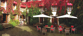
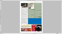
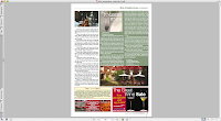
Top right picture shows a restaurant courtyard. The photo in jpg format is dropped into the magazine page and looks ok. But after conversion to press-quality PDF it appears as a solid blue rectangle. (picture below left)


To make the photo convertible:

- Open it in Safari or Preview and 'Print' to iPhoto (Save PDF to iPhoto option in the Print Dialogue window)
- check the image in iPhoto and import it into your Pages document.


If the image is fine in iPhoto it will convert properly in Pages-PostScript-PDF process. (picture on the right)

Once again I must say that I don't know why blue conversions happen, nor can I explain why 'printing' them to iPhoto resolves the problem. It simply works and as with most other tips on this blog it's all that matters.

I have tested this process several times with several different photos and have successfully used it in the magazine.


Please see a description of the blue conversion problem here and the Pages-PS-PDF process here.

Tuesday, August 05, 2008

Blue conversions - solution found!


I had a serious go at the blue conversions mystery the other day. And though I couldn't find out why it happens, I did find a solution.

Watch this space: I will soon publish the step-by-step guide to converting photos which come out as blue spots after the usual conversions process.

Friday, July 25, 2008

Simple Tricks with Photos: Fading Out Photos from Side to Side

I have been searching for some help in Pages for photo editing. Wondering if you could help me. I am wanting to fade a photo from opaque on the left through to transparency on the right. Do you know how to do this?
Andrea Stevens

My first reaction to this problem was no, it's not possible in Pages.

However, having thought about it for a few days, I think I found an easy solution with just the tools available in Pages:

1. Original photo:
Photo by Shu Milne
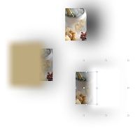
2. Fade with white object and black shadow:

3. Fade with black object and black shadow:


4. Beige fade with beige object and beige shadow:


Of course, it's not exactly what Andrea had in mind, but perhaps it may do while you are getting round to have it done in a graphic programme.

Here is how to:
- import photo into Pages,
- create an Object with colour fill of your choice,
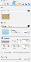
- give it a Picture frame with blurred edges (lower row, left),
- set Scale to 50 percent,
- check Shadow and pick the colour of the shadow from the original photo,
- offset at 50, blur at 72, opacity of the shadow at 50 percent,
- position and resize the object to cover the photo so that it looks as though the photo itself is fading from right to left or left to right,
- make a cropped screenshot (as used here) or 'print' to PDF and crop to create the image you need for your project.

See fading in progress in picture on the left and settings used in the Graphic Inspector on the right.


Hope this helps and I welcome all comments, questions and suggestions.

Also read this previous article:
Fading out background image

Addendum (December 2014)
This post shows menus (Graphic Inspector) from an older version of Pages. If you are using the current version, end of 2014, the menus will look different. Screenshots below show where to find frame (line, picture) styles.
- First select the image (photo or graphics), Then click on Format at the top right of the document and then click on the small triangle next to Border.
- Note that frame thickness and colour can be changed. Click in the colour well to open the colour viewer to choose colour. Click on up/down arrows to change the thickness of the frame.


Wednesday, July 23, 2008

'Blue conversions' problem and a few workarounds


This problem comes out of the blue and there seems to be no pattern to it happening. An ordinary looking JPG or PDF would not convert properly from Pages to PDF, but instead appear as a solid blue (cyan) shape.

It happens sometimes even when existing graphic elements which had converted successfully before, are just updated. Files made in Illustrator, Photoshop or InDesign could be affected.

I could not find out why this happens or how to resolve this.

If you are struck by the 'blue conversion' problem here are a few workarounds I've used:

- try converting again, sometimes the problem 'just goes away'
- ask the file to be resent to you in high-definition PDF
- try converting on another computer
- if all of the above doesn't work, ditch the file and find a different one which fits with your project.

A friend who works with me said: 'Sometimes it's best not to try and work it out - it fries your brain!'.

Still if anyone has an explanation or a solution I would like to hear very much.

This striking photo of 'champagne breakfast' turned into a solid cyan rectangle after conversion.


Photo by Shu Milne

Wednesday, July 02, 2008

A point of reference for iWork/Pages users


I started this blog to keep track of all my numerous scribbles with tips, tricks and solutions I found while working in iWork/Pages. They were mostly meant as reminders to myself.

However, over the past two years I Work in Pages has become a popular point of reference and exchange of information on iWork/Pages with thousands of visitors from all over the world, from Beverly Hills, California, to Moscow, Russia, and from Trondheim in Norway to Dunedin in New Zealand.

Top viewed articles on the blog deal with high-quality professional printing and producing PDFs which is obvious, because this aspect of using Pages is not sufficiently covered, neither in the user's manual nor anywhere else. But some of the 'bestsellers' on this blog came as a complete surprise to me. For example, a small item on where in Pages is word (character) count suddenly shot to the top of the list of most viewed articles even though it's rather easy to find.

I am delighted by the response and welcome all questions and suggestions. Here are some of the comments sent to I Work in Pages:

E. from Norway said (re. Three steps from Pages to PDF):

THANK YOU SO MUCH!!!

Saved my life...


exegete77 said:
Thanks for all your helpful hints. I just discovered your blog today and will continue reading through your archives.

Sister Julie said:
I just got my first Mac and chose to go with iWork. I was happy to stumble upon your blog which is helping me make the transition from Word to Pages. Excellent job. Thanks for the work you do.
Sister Julie, Chicago

Al Coffman said (re. Three steps from Pages to PDF):
Just a note of thanks. Your post solved a problem for us in a quick and clear manner! Merci beaucoup.

Anonymous has left a new comment on your post "Preparing colour separated PDFs using ColorSync":
Thank you! My printer needed a CMYK pdf and I couldn't find a solution until I read this.
Not everything you suggested worked out for me though - I couldn't set the resolution because the I couldn't locate the commands you suggested. I'm working in Pages '08 - maybe they have created a higher dpi as a default? Best wishes,
Karyn

Uri has left a new comment on your post "Quick JPEGs straight from Pages":
REALLY USEFULL!! I created a flyer, but I needed it in JPG...
Thanks 4 the trick, man!


Anonymous said (re. Quick word count in Pages):
Thanks! I am writing a paper and was wondering where that darn word count was!

Corey Koch said:
Well Done.
I am a graphic designer, living in Normandy and have seen your magazine from the start. Having used Quark Xpress for the last seventeen! years, I am amazed you managed to get it looking this good.
I can pick holes but, hey, there must be a future without Quark holding us to ransom. Well done!
We enjoy reading it.
Corey Koch

Wednesday, April 30, 2008

Fitting more text into an object than it can take


Objects often can't take all the text that you want to fit into it at the font size you want it to be, even after the inset margin is set to zero. This problem occurs often with nonrectangular objects - ovals, stars etc.

One way of going round this problem which I've been successfully using is to superimpose a separate Text Box over the Object (shape):

- format the Object (rectangular, oval, star etc.) the way you want it to look;
- create a floating text box, set wrap to none, make frame invisible, set dimensions to be equal or slightly bigger than the object, type in your text, format it the way you want it to look 'inside' the object;
- move text box over the oval (use 'Bring to front' under Arrange menu if the Text Box slides under the shape);
- Group the object and the text box together or 'Print' to PDF if it is to be used later as a repeating feature, like, for instance, an ad booked for a long series.


That way you can 'fit' much more text with letters almost touching the edges of the object which is not possbile if you try just to type inside it.

This simple trick could also be used for attractive design purposes, when letters inside an colour-filled object touch or even 'poke through' the frame of an object.

This method is similar to the 'patchwork' tehcnique of making quick-fix corrections in ready supplied images and text files in PDF format. Please check this earlier article:
Last minute corrections - use patchwork
Photo: apple blossom coming out

Monday, April 21, 2008

Last minute corrections - use patchwork.


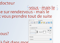
Last week the designer who works with me was travelling in Italy when the proof reader discovered a few typos in the page which was supplied to me as a PDF module originally created in Illustrator. (There are types of PDFs which Enfocus PitStop can't get into!) I couldn't get through to her and had to correct the typos by superimposing text boxes over the text, matching the colour, the font and filling the box with gradient colour fill to match the background (top image shows the word rendez-vous spelled the French way, correctly, image below shows the text box with corrected part of text ready to be moved into position).


The simple technique of using patches always helps when you need to make last minute minor corrections in photographs, graphic images and text. Here is how it works:

- create a Text Box (or Object), type in correct word or letter sequence, adjust font and point size to match the original, set Stroke (frame) to none (image at right);
- uncheck wrapping in the Wrap Inspector;
- under Arrange menu make sure your patch is at the front: slide down to 'Bring to front';
- resize the text box so that it doesn't clip adjacent letters or lines. If you find it difficult to resize the box by dragging box handles, try doing it through Metrics Inspector. It allows discreet millimetres - down to tenth of a millimetre;
- move the patch to cover the text which needs correcting to align with the rest of the text - with keyboard arrows first. Then, if the patch does not align exactly, use Metrics Inspector to adjust coordinates - x for horizontals and y for verticals. Keyboard arrows move objects by the typographical point, but in Metrics Inspector you can move objects by the tenth of a millimetre;
- go to Object inspector, choose colour fill or gradient fill. Using the magnifying glass (loupe) in the Crayons window of Colours Inspector match the object colour fill to the background colour. Hide layout and invisibles to check if your patch matches the background and covers the corrected text.

Patchwork technique is very flexible and could be used for improving minor problems with photos and other images. But I suggest treating this as a quick fix rather than as a standard solution.

However, looking back, I see that over the past two years I've used patching many times to enhance photos or adjust them to layout requirements. Here are two examples.

1. There was a crease in the Marmite&croissant studio photo for our launch issue cover (image on the right, before patching). I put two patches - gradient colour filled objects on both sides of the marmite jar. Matching colour fill of an object is done as follows.
- in Object Ispector choose Gradient fill;
- click on one of the colour bars and when the colour well opens (crayons) click on the magnifying glass above/left of the crayons box (keyboard shortcut to open the colour well any time: Command+Shift+C).
- The cursor turns into the magnifying glass, hover it over the colour you want to copy, as close to the patch as possible - and click.
- Gauge in which direction the colour changes and repeat the same procedure with the second colour bar.
- Rotate the gradient direction wheel in the Inspector to adjust the colour change flow (image below right shows patch in position, with rectangular patch slanted to avoid cutting into the side of the jar).


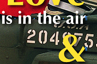
2. The February Rendezvous magazine cover photo shows a just married couple sitting on a WWII vintage Willys Jeep. White straplines went nicely over olive green jeep body, but the white army markings were a bit distracting. In between the straplines (in text boxes) and the photo I put a shape with rounded corners, filled it with olive green matching the body of the Jeep and set opacity to 75 percent. This dimmed the white of the markings and made the straplines stand out better. To align the patch with the rest of the Jeep I tilted the patch right-downwards through Metrics Inspector.


To view full images of the May 2008, February 2008 and June 2006 covers of the Rendezvous magazine go to the Rendezvous Editor's Blog here
For more ideas check these earlier articles:
Preview as a cropping device
Extracting portions of a Pages document for separate use
Sharing and teamwork in iWork/Pages

The Rendezvous magazine June 2006 and February 2008 photos are by Mike Forster, Images of Normandy
Related Posts Plugin for WordPress, Blogger...

Copyright

© 2006-2010, 2010-2017 Alexander Anichkin, All Rights Reserved.
All content is original and was created by me, the author and publisher of I Work in Pages.
Quotations and images are attributed where applicable.
No republication without express prior permission.
Blog template by Blogger with customisation by the publisher.