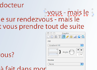
Last week the designer who works with me was travelling in Italy when the proof reader discovered a few typos in the page which was supplied to me as a PDF module originally created in Illustrator. (There are types of PDFs which Enfocus PitStop can't get into!) I couldn't get through to her and had to correct the typos by superimposing text boxes over the text, matching the colour, the font and filling the box with gradient colour fill to match the background (top image shows the word rendez-vous spelled the French way, correctly, image below shows the text box with corrected part of text ready to be moved into position).

The simple technique of using patches always helps when you need to make last minute minor corrections in photographs, graphic images and text. Here is how it works:
- create a Text Box (or Object), type in correct word or letter sequence, adjust font and point size to match the original, set Stroke (frame) to none (image at right);
- uncheck wrapping in the Wrap Inspector;
- under Arrange menu make sure your patch is at the front: slide down to 'Bring to front';
- resize the text box so that it doesn't clip adjacent letters or lines. If you find it difficult to resize the box by dragging box handles, try doing it through Metrics Inspector. It allows discreet millimetres - down to tenth of a millimetre;
- move the patch to cover the text which needs correcting to align with the rest of the text - with keyboard arrows first. Then, if the patch does not align exactly, use Metrics Inspector to adjust coordinates - x for horizontals and y for verticals. Keyboard arrows move objects by the typographical point, but in Metrics Inspector you can move objects by the tenth of a millimetre;
- go to Object inspector, choose colour fill or gradient fill. Using the magnifying glass (loupe) in the Crayons window of Colours Inspector match the object colour fill to the background colour. Hide layout and invisibles to check if your patch matches the background and covers the corrected text.
Patchwork technique is very flexible and could be used for improving minor problems with photos and other images. But I suggest treating this as a quick fix rather than as a standard solution.

However, looking back, I see that over the past two years I've used patching many times to enhance photos or adjust them to layout requirements. Here are two examples.
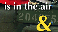
1. There was a crease in the Marmite&croissant studio photo for our launch issue cover (image on the right, before patching). I put two patches - gradient colour filled objects on both sides of the marmite jar. Matching colour fill of an object is done as follows.
- in Object Ispector choose Gradient fill;
- click on one of the colour bars and when the colour well opens (crayons) click on the magnifying glass above/left of the crayons box (keyboard shortcut to open the colour well any time: Command+Shift+C).
- The cursor turns into the magnifying glass, hover it over the colour you want to copy, as close to the patch as possible - and click.
- Gauge in which direction the colour changes and repeat the same procedure with the second colour bar.
- Rotate the gradient direction wheel in the Inspector to adjust the colour change flow (image below right shows patch in position, with rectangular patch slanted to avoid cutting into the side of the jar).

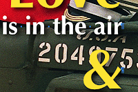
2. The February Rendezvous magazine cover photo shows a just married couple sitting on a WWII vintage Willys Jeep. White straplines went nicely over olive green jeep body, but the white army markings were a bit distracting. In between the straplines (in text boxes) and the photo I put a shape with rounded corners, filled it with olive green matching the body of the Jeep and set opacity to 75 percent. This dimmed the white of the markings and made the straplines stand out better. To align the patch with the rest of the Jeep I tilted the patch right-downwards through Metrics Inspector.


To view full images of the May 2008, February 2008 and June 2006 covers of the Rendezvous magazine go to the Rendezvous Editor's Blog here
For more ideas check these earlier articles:
Preview as a cropping device
Extracting portions of a Pages document for separate use
Sharing and teamwork in iWork/Pages
The Rendezvous magazine June 2006 and February 2008 photos are by Mike Forster, Images of Normandy

No comments:
Post a Comment