Showing posts with label logos and iWork/Pages. Show all posts

Friday, May 03, 2013

The Runner. How to draw a logo.


I took part in the May Day 10 km road race in Avranches, Normandy. While pottering about at the start line I noted club logos on runners' vests. After coming back home I've made my own. Here it is.

It's made of four curving lines. To draw a line in Pages, choose the Draw tool from the Shapes menu (or Insert > Shape > Draw with Pen). Click two or three times and double-click on the last dot to create a draft line. Then make it editable: Format > Shape > Make Editable, and then give it smooth curves: Format > Shape > Smooth Path.

Move the red dots - editing points - to give the lines desired shape. Each editing point when selected shows curving handles. Click and drag to change the curves of the line.

At some point choose a style for your lines and give them colour. It could be right when you begin your design or at some point later. A choice of styles is in Graphic Inspector under Line. Click on the drop-down menu and see which of the styles suits your design best.

 The picture below shows one of the lines being edited.

Sunday, February 19, 2012

A man and a woman: how to show gender in logos.

I was working on a logo design this morning and thinking: how can I indicate the gender in the simplest of ways. I mean, without references to the obvious differences in the attributes of sex.

This is an idea that came to me when I was just staring at the Shapes drop-down menu. For the man's head, use Rectangle. For the woman's, use the Quote Bubble.

The body shape can stay the same, but the square gives it an immediate 'masculinity' effect. Rotate the Quote Bubble's small spike to top right, it will look like a pony-tail and give the shape a 'feminine' effect.

Simple and effective!

  This is a quick draft in low resolution png format. If you want to order a similar design, please contact the publisher.

Wednesday, February 08, 2012

Minimalist Nude 2 (drawing pictures and logos)

Minimalist Nude
A few weeks ago I published 'Nu Minimale', a picture made with iWork's draw tool. The tool sits as the last option in the Shapes menu. It is for creating free-drawn (custom) shapes.

In other words, it's an artist's tool. Look at it as a pencil, a piece of chalk, a brush or a stylus.

To create shapes click several times. Each click creates a dot and each next dot connects to the previous one with a line of default colour and thickness.

To make a closed shape, make a roundtrip with your clicks – and click on the first dot again. To make a line, double click on the last dot.

After the basic shape is created we can edit and modify it.

This is how it works.

Click one-two

Click two-three


Click three-four

Click four-five


Click five-six
And double-click on the last dot. 
Format>Shape>Smooth Path


This makes the line curving instead of angled. 
Choose a line style  
In Graphics Inspector, under Stroke click on Line and choose a line style from the drop-down menu.
Make curves
When you click on red dots – editing points, they turn white and show 'propellers'. Drag, pull out or push in to change the curves of the line. When you drag one propeller, the other one moves too. To move them independently, press Command while dragging. 


Curve the line until it resembles the curves of a body.

Watch an Adobe Illustrator's video tutorial to get the gist of how the curving function works. It's pretty much the same in iWork. 

See earlier post 'Nu Minimale'.
and have a look at 'Obama, Blues Brothers and Picasso'.

In this clip from Woody Allen's 'Midnight in Paris' Gil stuns Paul with his deep understanding of avant-garde art:


Wednesday, August 04, 2010

Fading Out Background Image (an example)

Read about a different technique: 
putting text on semi-opaque background in this article: 

How to make coloured text stand out on the same colour background.


Here is an example of how fading out the background image helps to make text stand out better.

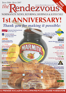
For the first anniversary of my magazine I designed a full page advertisement. I removed the straplines off the cover of the first issue of the magazine and arranged logos and small text ads from our regular advertisers and partners over the main cover photo (read this previous post with some other tips). Even though the original picture has off-white background allowing to put a lot of text (straplines) onto it, fading out the photo made text and logos more clearly visible and the old front page of the magazine 'stands back' to accentuate the thank you message to supporters.

Use Opacity slider
'Send to Back' function is under Arrange menu. Current versions of Pages also have more powerful options of Sending Object to Background and making it unselectable, so you can carry on working without the risk of accidentally moving the background image. 

To fade out the image move Opacity slider at the bottom of the Graphics inspector to a lower percentage count. Here the marmite image is set at 85 percent.


Putting an image (object) in the background and fading it out can have other uses:

- colour background: make a shape in your Pages document, give it colour fill of your choice, resize so it covers the whole page - and send it to background; 

- watermark effect: take your logo (or any image), enlarge it, fade out to between 40 and 60 percent - and send to background; 

- theme page effect: take festive images (fireworks etc.), moody landscapes, old black and white photos or clip art fade and send to back to give pages devoted to a particualr theme a unifying effect; (read Remembrance Theme: Using Background Images)
- colour coding: give your magazine or brochure coloured margins by 'bleeding' images or coloured shapes (positioning them to overlap the margins of the page), so that when the publication is closed you can see coloured sections in it;
- branding (repeated theme) effect: when you are developing an image to become associated with you or your business, a logo for example, you may want to place it repeatedly on your stationery, on pages of your brochures and catalogues. Fading out the image could help this marketing technique be less obtrusive, but without losing efficiency.

The original picture of a Marmite jar and croissants, to symbolise the blending of English and French cultures, was made by the famous Fleet Street photographer Mike Forster, design concept by Miranda Ingram.
Related Posts Plugin for WordPress, Blogger...

Copyright

© 2006-2010, 2010-2017 Alexander Anichkin, All Rights Reserved.
All content is original and was created by me, the author and publisher of I Work in Pages.
Quotations and images are attributed where applicable.
No republication without express prior permission.
Blog template by Blogger with customisation by the publisher.