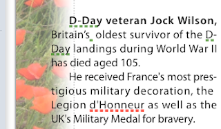
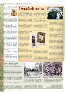
 The photo of red poppies lining a Normandy field is used here to create a graphic margin for the Remembrance page in our magazine. The image is one of a series of photos I took this Summer.

Here is how it works:
- Import original photo with poppies (top right image).Now the photo is behind all other elements of the page.
- Under Arrange menu - Send to Back.
- In Metrics Inspector click on rotation wheel or on degrees arrows to rotate the photo so that the line of red poppies is vertical.You can also rotate the photo by pressing Command and dragging the photo's handles (little squares in the corners).
- Resize and move the photo so that the vertical line of poppies is on the margin of the page.In my version of Pages it is the bottom left option. Blurred edges create romantic, moving feeling about the whole graphic composition.
- Mask and edit mask so that the right side of the image slighlty, only just, overlaps the text. (top left image)
- In Object Inspector (update: Graphics Inspector in current version of Pages) add picture frame with blurred edges.
- Reduce opacity of the image (also in Object Inspector).Fading out the background image by reducing its opacity is needed to avoid a large graphic element dominating the page and also, because it overlaps the text in the first column, to make the text visible.
The whole process may sound complicated, but in fact it is rather easy to do - and very enjoyable. The things you do for England!
I was slightly concerned about the slanted line of horizon visible at the top, but then realized that, serendipitously, I gave the photo a 'fallen soldier' effect - you fall down and the earth and the sky look tilted in your eyes.
Whenever you use a photo as the background image always consider reducing opacity. I think it is the best way to achieve better visibility for text and other graphic elements 'in front'. Of course, light, consistently coloured images may not need this. Like the 'old parchment' image behind the main article on this page. The image itself is from the Musical Concert Poster template which comes with your copy of Pages.
Note: Click on pictures to see small details
Please also read these related articles on I Work in Pages:
Remembrance poppies: make your own clipart in Pages
Simple tricks with photos: fading photos from side to side
Fading out background image
and see other photos of red poppies in Normandy on our Readers' Photos blog here and here
If you use the photos please credit them to the Rendezvous Media.


Thank you so much - I read this today and used it for an important project! Very helpful.
ReplyDeleteThanks!
ReplyDelete