Tabbed folder shapes are popular with designers. Not only because they are a means of grouping text in bite-size attention grabbing chunks, but also, I think, because there is a subconscious link to what every computer user sees on their screen - a multiplicity of folder icons.
Another explanation, especially applicable to design of magazine covers with large photos going up to the edges (bleeds), is that tabbed folder shapes make it easy to avoid text clashing with the photograph - various images and colours in the photo make it difficult to see the text clearly (read this article on how to make text stand out). Or, the other way round, because it is difficult to find a good photograph over which straplines stand out.
While there is no ready folder shape available in Pages it is very easy to design one.

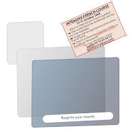
- Insert two rounded rectangles in a Pages document (either from Insert>Shape submenu or from Shapes menu in the toolbar).
- Make one shape much smaller than the other and position behind the larger one.
- Adjust the curving of the rounded corners in the way you like (click on the little circle next to the top right handle of the shape - and drag.)
Now you have a simple two dimensional folder shape. But can something similar to the familiar small 3D Mac-folder (image below) be designed in Pages?

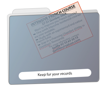
I spent a little time working on this and here is what I got (top right image).
The tab and the back cover of the folder are the same two rounded rectangle shapes, the darker front cover is a third.
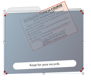
The tilted effect is achieved through making the shapes editable (Format>Shape>Make shape editable.)


After making the shape editable you will see little red circles at the corners. Click on them one by one to drag or move with keyboard arrows. I dragged the top left corner of the large light-grey rectangle to the left to get the look of an opening folder. The top and bottom right corners of both the front and the back covers are dragged up.
If you later decide you are not entirely happy with your artwork, edit the shape by clicking twice - not double-clicking. Click, pause, click again - and the little red circles in the corners appear.
This gives a 3-dimensional effect which is further enhanced by adding Gradient Colour fill to the front cover. Do it in Object Inspector. Rotate the angle wheel to make the colour flow from light grey in the top left corner to dark grey in the bottom right corner.
Now, how do I put the draft small ad inside the folder? Tilt the ad with the Rotate wheel (Metrics Inspector), move it over the folder and
use Send Backward (under Arrange menu or with the keyboard shortcut - press ⌥⌘⇧ and type B) to move the object 'inside' the folder (i.e. behind the dark-grey rectangle).
Next, if you'd like to make the folder semi-transparent, reduce opacity in the Object Inspector. Here opacity of the folder 'cover' is set at 85%.
The label is another rounded rectangle with white colour fill.
Read more about designing original shapes in these previous articles on I Work in Pages:
Creating clipart and original shapes in Pages
Maps in Pages
Creating your own clipart with Instant Alpha
and about using Send Backward/Bring Forward keyboard shortcuts here.

No comments:
Post a Comment