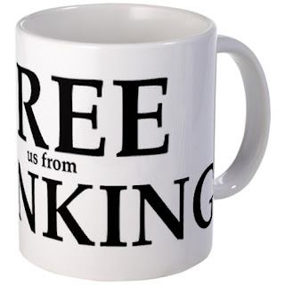
'Free [us from] Banking' is another design I've added to my gallery on CafePress. You can see it there on various products, such as t-shirts, bags and mugs, as in the picture here. Click on the picture to see the products with this design on CafePress.
The effect I was aiming at is to have two slogans in one. When you glance at it quickly, you only see 'Free Banking.' When you look again, you see 'Free us from Banking.'
I put each line in a separate text box which allows more freedom in moving the chunks of text.
I made the key word 'Free' largest at 180 points, 'Banking' smaller at 144, and 'us from' at 34. The font used is Palatino Bold.
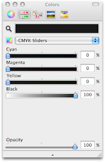
 For best results when printing in black type, remember to change the colour to 'true black.' In the Colour viewer (Inspector), click on sliders, choose CMYK and set Cyan, Magenta and Yellow at zero, and Black (K) at 100 percent.
Convert your Pages document to PDF and upload to CafePress.

Hi I have a quick question for you! I'm having a lot of trouble with keeping the formatting in my Pages document the way I want it. I'm looking for a job right now and I have a resume that I open and make changes to multiple times a day. I save it as a Word document. Every time I open the document, the formatting has been altered. For example, there are extra lines in between tables that I didn't put there, and the table's borders are supposed to be invisible, but when I open the file the lines are visible. This is a problem because when my potential employer opens the file, my resume might look sloppy and unprofessional. I have converted it to a PDF file, but some employers prefer Word documents. Can you make a post about keeping the formatting the same, or how to stop automatic formatting? I know how to do it in Microsoft Office, but in Pages nothing I do seems to help. Thank you!!
ReplyDeleteGood idea, thanks! I'll have a think and post.
Delete