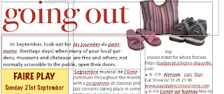
In the first picture the bulleted text with monthly events calendar jumps up in broken lines because the Going Out graphic panel is made as an Alpha (no background) object. Setting a higher wrap count doesn't help because lines will still be broken and text in the wide text box to the left would be affected.
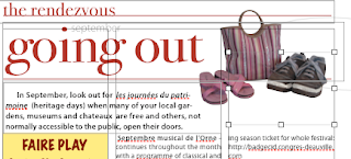
One way of dealing with this layout problem is to use an invisible object, here, in the second picture, it is a rectangular object positioned above the text in the right-hand column. To do this:
- create a floating object,
- in Object Inspector set Fill to none, Stroke to none to make it invisible in the final document (PDF),
- position the object so that it slots within the column grid,
- and adjust the size and wrapping of the object so that the top lines of text in central and right-hand column are level.

Now the layout looks tidy.
This is a simple layout trick that works well when you find it difficult to make text flow around any object on the page the way you want it to. Not just rectangular objects can be used, but ovals and other shapes.

No comments:
Post a Comment