 Read this previous post about the background for the page shown here.
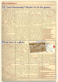
This magazine page shows the layout grid (shortcut to show: Command+Shift+L, type again to hide) and all the objects on the page selected, showing their handles.
The page is designed in Word Processing mode. You have to choose the mode when you start your project.
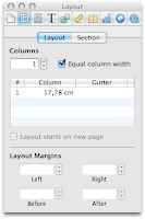
Note that the top of the page has a one and four-column layout for text. You can choose the number of columns in the Layout Inspector.
The heading at the top is in one column, then there is a layout break, followed by the four-column layout.
 The lower half of the page is a combination of two Text Boxes and two graphic images, slightly tilted.
To tilt, use rotate function: press Command and then drag one of the handles of the photo. You can use rotating wheel or arrows in Graphics Inspector.
There is also a flip function. In the left photo the airplane can go leftward or rightward when you flip the image. Be careful: if there is lettering in the image, it will be inverted like in the mirror if you flip the photo.
In this design, what holds the text in four columns at the top half of the page is wrapping. Text boxes in the lower half push the text above into the four-column layout.
Adding a layout break at the end of the article at the top of the page will also keep the text in four columns. But you may find that using text boxes alongside the layout gives more flexibility.
In Page Layout mode, use Text Boxes to create a multiple column layout.
The image here is a screenshot. Actual PDF will have a much higher definition suitable for high-end printing.
Read more in my new book 'iWork for Mas OSX Cookbook'
Follow me on Twitter at iworkinpages
Like my page I Work in Pages on Facebook
and add me to your circles on Google+

Great post as always,Thanks for taking time to share this useful post here with us...
ReplyDeleteNice share!
ReplyDeleteRelated: pdf sdk, pdf text