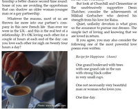
Tables are widely used to organise numbers and do calculations automatically. But what is often overlooked is that they could also serve as a powerful and easy to handle tool for arranging text and illustrations - putting them in required position on the page and changing dimensions and proportions while avoiding too much hassle with layout breaks or shuffling multiple text and picture boxes.
 While laying out a page of my magazine recently I was asked to position a photo and a poem horizontally next to each other. Photo on the left, and poem on the right. And the poem should have looked as the closing text sequence of the article above.
It could be done with a layout break, setting a two column layout, putting the photo as an inline object in the first column, inserting column break and putting the poem at the end of the second column.
Instead:
- I put a table in the page,
- set wrapping to fixed on page,
- set rows number to one,
- column number to two
- and unchecked the header row.
As a result you get a very flexible shape which allows you to adjust the proportions and dimensions while images and text stay inside the table cells.
- So, the photo went into the left cell via image fill (in Object Inspector, scale set to 'fill') and text went in the right cell.
- Then I selected the whole table and set stroke to 'none'.
- After that the table is moved and resized to snap to the columns grid of the whole page and to have the text of the article fit above. The picture cell width is adjusted to be exactly as the column width of the page. Text in the poem cell is adjusted with inset margin, tabs and space before and after paragraphs - all in the Text Inspector.
In the end the picture and text look as though they are independent of each other, but positioned exactly side by side.
This method is also very useful to position photo captions - instead of moving the photo and text box, grouping and regrouping them, you get an object which can be easily resized and repositioned - as one.
Photo: Apple trees in January - will those buds bloom?

No comments:
Post a Comment