Showing posts with label iWork Pages text formatting. Show all posts

Thursday, August 22, 2013

Free Banking.


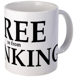
'Free [us from] Banking' is another design I've added to my gallery on CafePress. You can see it there on various products, such as t-shirts, bags and mugs, as in the picture here. Click on the picture to see the products with this design on CafePress.

The effect I was aiming at is to have two slogans in one. When you glance at it quickly, you only see 'Free Banking.' When you look again, you see 'Free us from Banking.' 

I put each line in a separate text box which allows more freedom in moving the chunks of text. 

I made the key word 'Free' largest at 180 points, 'Banking' smaller at 144, and 'us from' at 34. The font used is Palatino Bold.

For best results when printing in black type, remember to change the colour to 'true black.' In the Colour viewer (Inspector), click on sliders, choose CMYK and set Cyan, Magenta and Yellow at zero, and Black (K) at 100 percent.

Convert your Pages document to PDF and upload to CafePress.

Thursday, May 30, 2013

How to disable automatic lists.


Lists, numbered or bulleted, are an attractive way of organising text on a page.

But when you are finished with a list and want to get back to normal text format your Pages document may automatically format each new paragraph as a new list item.

You may also want to do a list manually by simply putting numbers or bullets at the beginning of some but not all sentences. And iWork automatically formats each paragraph into a list item.

There may me other situations when you don't want Automatic list detection.

To disable this function open Auto-Correction Preferences: Pages > Preferences > Auto-Correction Preferences. There uncheck the 'Automatically detect lists' option. iWork will stop annoying you with creating lists you don't want.


Read more in my new book 'iWork for Mac OSX Cookbook' (2012)
Follow me on Twitter at iworkinpages  
Like my page I Work in Pages on Facebook 
and add me to your circles on Google+ 

Tuesday, May 21, 2013

Trouble with Footnotes in Pages?


A reader has complained about footnotes in Pages. They jump around, especially when long, and drive the man crazy.

I don’t use footnotes much, but have just tried putting a few in a text of mine. 

Pages lets you add footnotes and endnotes. 

- Click in the body of text after the word where the footnote is to be placed.
- Go to Insert menu and slide down to Footnote.
- A small number will appear perched above and to the write of the word and a numbered footnote will appear at the bottom of the page.


What seems to be happening is that, as you add them, footnotes push the main text on the page up and the overflow goes on the next page. If the part of text to which the footnote refers is pushed over onto the next page, the footnote automatically jumps to that page too. 

The numbering stays continuous or changes to restart on each page, as you set it in Document Inspector. You can also change numbered footnotes to less frequently used stars, or Roman numericals, or Greek letters. 

You shouldn’t have much trouble with footnotes in Pages. At least not more than you’d have with using footnotes anyway.


Footnotes are an attribute of academic writing, where every statement or argument you make needs referencing, i.e. an attribution or an indication of an authoritative source. You may see footnotes in encyclopedia articles and legal documents. Sometimes, when a word, a phrase or a section is in a foreign language, you may put the translation in a footnote. Footnotes may also include hyperlinks taking you to a relevant internet page. 

Footnotes are usually placed at the bottom of the page. Sometimes, in order not to distract the reader or when the commentary in footnotes is long, they are grouped together at the end of the document/article/book, or at the end of the chapter (section). In this case they are called endnotes.

See also 'How to subtract footnotes and endnotes from the word count'.

Read more in my new book 'iWork for Mac OSX Cookbook' (2012). Follow me on Twitter at iworkinpages, like my page I Work in Pages on Facebook and add me to your circles on Google+.

Sunday, December 16, 2012

Where is the copyright sign on the keyboard?


If you decide that your text or photo needs copyright protection, you may want to add the  ‘copyrighted material’ symbol to it with your personal name or the name of your business.

The symbol sits on the same key as the letter ‘g’ on British and American QWERTY keyboards. Press Option and type ‘g’, you will get the ‘c’ inside a circle — ©. On the French AZERTY layout the sign is with letter ‘c’. Press Option and type ‘c’.

Registered (®) sign is Option+R on both QWERTY and AZERTY layouts.

Copyright (©), registered (®), trade mark (™) and a number of other letter-like signs are also in the Character palette. Under Edit menu choose Special characters and when the character palette opens go to Symbols >  Letterlike Symbols. Find the sign you want, click on it and drag to your document. It inserts in text like a letter. 

Characters from the pallette work with TextEdit too: access the Character palette via Edit > Special characters.

Monday, March 28, 2011

How to Type Various Dashes and Hyphens


In ordinary day-to-day scribbling you may not need to go beyond the usual horizontal dash-hyphen at the right of the top row on your keyboard. For a more formal presentation, such as a letter to be printed out and sent by post or attached to an email, you may want to consider using 'proper' hyphens and dashes. If you write professionally, it may be the house-style requirement.

The three common types are as follows:

   Hyphen, it's on the QWERTY keyboard to the right of the zero.
   Longer, called n-dash. To type, press Option (Alt) key and type hyphen.
Still longer, called m-dash. To type, press Option+Shift key and type hyphen.

Don't type two hyphens (--) to represent a long dash, it looks untidy and amateurish.

If you edit copy and want to replace short hyphens for longer dashes, open the search window (Command+F). In the search space at the top type Space+Hyphen+Space (not the words – just hit the space bar, then hyphen key, then space bar again!). In the Replace window below type Space+Option/Hyphen+Space. Then replace all or one by one.

Here is what the Oxford English Dictionary says:

dash – a horizontal stroke in writing or printing to mark a pause or break in sense, or to represent omitted letters or words.
hyphen – the sign (-) used to join words to indicate that they have a combined meaning or that they are linked in the grammar of a sentence (as in pick-me-up, rock-forming), to indicate the division of a word at the end of a line, or to indicate a missing or implied element (as in short- and long-term).

On the various and often confusing rules and styles on hyphens and dashes read an extensive article on wikipedia.

Read also 'Editing Large Texts: the Many Uses of Command+F Function'

Friday, October 29, 2010

Frequently Used Repeated Text. Storing for Easy Access.

A reader if this blog recently asked me if there is a way to store frequently repeated text, i.e. disclaimer, address, slogan or business description, in such a way that you have quick and easy way to copy-paste it into a new document.

It would be a great idea to have two or more Clipboards - like you can have several Inspectors open for one document - store repeated text on one clipboard, use another for copy-pasting. But no, we don't have that option. Still there are several other simple ways of storing repeated text.

- Put your file in the side-bar of a folder. In the side-bar of any open folder there are several folders by default: Home, Applications, Desktop etc. You can drag any folder or file there for quick access. So type your frequently used repeated text in TextEdit, save and drag to the Side Bar. Next time you need it, click on the file alias in the Side Bar and the file will open (launching the application in which it was created). Select the text and either copy-paste it or drag to your document.


- Drag from Stickies. Another similar trick is with Stickies. Launch Stickies (if they are not in the Dock by default, find them in Applications folder), type your text, highlight it and leave the sticky hanging somewhere in the corner of your screen while you work on the main document. Current versions of Stickies can make them float in front of all other open windows and be translucent - you can see your document even when there's a sticky hovering over it. When you need the repeated text, go to the sticky, click AND HOLD on the text and drag it to where you want it appear in your document. You don't need to switch Applications - grab and drag without leaving Pages, or whatever other programme you are in.

- Put the file with repeated text in the Dock. Two options here.
First, on Macs, open windows  collapse and sit in the right-hand side of the Dock when you click on the yellow button or double-click on the top bar of the document. You can leave a document with repeating text there.
Second, if you need the repeated text for a longer time, drag the icon of the file without opening to the right-hand side of the Dock and leave it there. When you need it, click - and it will jump up open.

Please drop me a line if you know other ways of storing frequently repeated text.

Saturday, June 19, 2010

Friday, January 23, 2009

How to change underline colour


A client sent me text in blue colour with some words underlined. When published in print, the text had to be in black. I select the text, open colour palette, click on black – text colour changes, but the underline stays blue. What to do?

When a portion of text is underlined in a colour different from the text and you want it to be the same, here is how to do it:
- Select (highlight) underlined text;
- Open font panel (Command+T);
- Click on underline button and choose Colour from the drop-down menu, the last option. When colour palette opens click on the colour you want.


Some tricks sink in without any effort, but for some reason I always stumble over this one. Can't ever remember how to do it without going to the Help section.

So, even though it is simple (when you know it) I decided to put it here just because I think that if I get stuck there are others out there who can't immediately figure out how to solve it.

Saturday, November 22, 2008

Word count in Pages: use two Inspectors


Word count in Pages - where is it?
Open Inspector,
click first icon - Document
and click on the third tab - Info.
Here you get all document statistics, including word and character count. To get word count in a selection, click and drag cursor to highlight it.

Recently, on two different days two new colleagues have started, for the first time, working in Pages in our office. The first question they asked? 'Where is the word count?'

When you work on a text document which must have a particular word count, for example, to fit in an allocated space on the page or answer academic requirements for length, you watch the word count all the time. But you may also need to do text formatting through Text Inspector. Switching between inspectors could be annoying. When I work on long text documents I open two inspectors - one for word count and one for word processing (text). This way word count is always at a glance distance.

To open the second Inspector go to

View>New Inspector

Read this previous article on I Work in Pages:
Quick word count in Pages

and for an overview of Pages:
Measuring iWork/Pages - against what?

Wednesday, October 01, 2008

Measuring iWork Pages - against what?


Walt Mossberg, a Wall Street Journal columnist and a writer on All Things Digital web-site, in a rather condescending though overall positive review of iWork 2008 suite writes this about Pages (August 2007):

The Pages program was originally more of a page-layout program than a writing tool. The new version attempts to fix this imbalance with a less artsy word-processing mode. But the effort is only partly successful. It still de-emphasizes some writer-friendly features. For instance, its auto-correct function is much weaker than Word’s. Another example: In Word, to see how many words your document contains, you just glance at the bottom of the screen. In Pages, you must dig down into a submenu to find the answer. The command for showing invisible formatting marks also is harder to find than in Word.


Word count in Pages, a source of numerous wailings, is indeed in a submenu (Writing Tools>Show Statistics). However only someone new to Pages would use this path, common in older versions of Word and AppleWorks/Claris. To set Pages to show word count instantly and dynamically:
- under View menu open New Inspector, set it to Document>Info and watch the word/character count as you type. Check word count in highlighted selections of text. Use the second Inspector for other tasks.
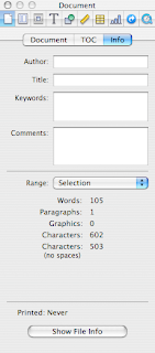

(picture on the left shows word count for the quoted text from Walt Mossberg's article.)

OK it's not at the bottom of your page, but it is at a glance's distance. Update (Jan 2012): Current versions of iWork/Pages show word count at the bottom of the page. Fuller count features – characters, lines, paragraphs etc. are in Document Inspector.  

Pages will remember that you had two Inspectors open and after you'd closed a document or quit the programme a new document will open with two Inspectors again, one of them ready to show Word count. Document Info Inspector can be positioned wherever it is most convenient for you - at the bottom of the screen for instance, if you want to stick with your Word habits. (Please read about word count in Pages on this blog here)

I was also mildly surprised at the comment that invisible formatting marks are harder to find. Yes, Word has the paragraph sign in the Toolbar which shows invisibles, but in Pages there is an easy to remember (and to type with either left or right hand) shortcut


Command+Shift+i for showing/hiding invisibles and Command+Shift+l for showing/hiding the layout grid.


In the Menu this command is under View.
(Please read a previous article on this blog about the two shortcuts here)


As a matter of principle I don't use AutoCorrect (how do you auto correct form when it should be from? and vice versa?) or autoanything and am against introducing into Pages the AutoSave function (horror: boss sees your autosaved 'draft' comments on her memo! you meant to delete them, but too late...) I have just looked at AutoCorrect options in Pages and in Word. They don't seem to be very different to me and both offer customisation.

I started working in Pages three years ago when work on the English language magazine for Normandy began. Over that period I have done a substantial amount of work in Word, including translations of two books from English into Russian and numerous articles from Russian into English. Over time I noticed that I was getting increasingly frustrated with Word, mostly because of its cluttered look, but also because I felt that somehow it took me longer to do word processing operations in Word than in Pages. Word looses to Pages in exactly this presence of too many formatting features, most of which user may not even need. In the end, when the last batch of translations came from my client in Word, I simply copy/pasted the text into Pages, did all the work, including proofing, referencing and word/character count, there and then copy/pasted the finished document back into Word to send to the client. Even though many of my co-workers and clients send me their documents in Word, my feeling is that there is less and less room for Word in what I do. In many cases I don't even open Word docs in Word, but in Pages or TextEdit.

Writing, editing and proofing tools in Pages, in my opinion, are superior to that of Word. In my line of work I find very useful the ability to check variations in spelling (British English/American English) with the built-in Oxford American dictionary, richer than the Word dictionary. The programme's Writing Tools (Edit Menu) also allow, again, direct from your open document, to do Google, Wikipedia and Spotlight searches. The former two are invaluable for editors, proofers and, I suppose, researchers, while the latter makes it easy to track numerous documents relating to a particular subject. Spotlight works from practically all Mac applications - Mail, Address Book etc.

Two general observations:

1- iWork is a developing new software - the progress from the first 2005 version to the latest is astounding. It has become much more than an office productivity suite. It is not clear to me where Apple intends to take it from here. I suspect that, concentrating on sales of affordable, status-sensitive hardware (iPhone, iPod) and on its 'switch campaign' (bringing Mac computers back into the mainstream) they simply don't have the resources to promote iWork as well as it deserves. Or it may be that Apple is just not ready for this. It may be, I also suspect, that Apple does not yet WANT to overmarket iWork so as not undermine its own top of the line design products.

2 - Comparing iWork with Office is not entirely correct, nor fair, I think. iWork gives ordinary self-taught users immense design power, up until recently only available to professionals. And it complements other applications and tools that come preinstalled on Macs - iPhoto, Preview, Mail, Safari, Address Book. So, in fact, iWork is not so much a stand-alone product like Office, but a naturally integrated Apple Mac application. I am, of course, partial, but in all honesty I'd compare Word to TextEdit (old Simple Text), the preinstalled Mac word processor, rather than Word to Pages. Apple has enhanced TextEdit over the last few years to the point that most day to day word processing tasks (letters, memos, lists etc.) can be done in TextEdit. It now takes photos and other graphics too. Font Panel and Colour Palettes in TextEdit are the same as in Pages. Instead, I'd measure iWork against InDesign and Quark, or MS Publisher. In fact, www.stocklayouts.com, a commercial web-site offering professionally designed templates, has recently added iWork/Pages to the list of compatible programmes, which also includes InDesign, Quark, Corel, Illustrator, Publisher and, yes, Word.

Friday, September 12, 2008

Pushing text with invisible objects

Pushing text away from a graphic object or making lines level may be tricky if you use just wrapping (Wrap Inspector).

In the first picture the bulleted text with monthly events calendar jumps up in broken lines because the Going Out graphic panel is made as an Alpha (no background) object. Setting a higher wrap count doesn't help because lines will still be broken and text in the wide text box to the left would be affected.

One way of dealing with this layout problem is to use an invisible object, here, in the second picture, it is a rectangular object positioned above the text in the right-hand column. To do this:

- create a floating object,
- in Object Inspector set Fill to none, Stroke to none to make it invisible in the final document (PDF),
- position the object so that it slots within the column grid,
- and adjust the size and wrapping of the object so that the top lines of text in central and right-hand column are level.


Now the layout looks tidy.

This is a simple layout trick that works well when you find it difficult to make text flow around any object on the page the way you want it to. Not just rectangular objects can be used, but ovals and other shapes.

Saturday, August 30, 2008

When an inline object suddenly changes dimensions...


...after copy-pasting.

We have a cheap advertising option in the classifieds section of the magazine. Simple box 46 mm wide by 31 mm high with a limited choice of colours. Client provides the text, chooses the colour and I paste the approved text into the box on a Pages template. After client's approval the box is copy-pasted into the classifieds section where boxed small ads are mixed with text ads as inline objects. The whole production cycle takes 15 minutes.

But on several occasions I came across an unexpected slight change in dimensions of the small ad box after pasting. When text in the box is sparse it hardly matters. But some people try to cram as much text as possible into the ad box they buy. Which is up to the client of course. And still in one case the telephone number jumped out of the box and in another a compulsory business registration number disappeared after pasting.

It took me some time to figure out why that happened. Instead of 46 mm wide the box would become 45,6 mm after pasting from the small ad template. So when text is crammed very tight the last line or two may be pushed out of the box even when dimensions change only by a fraction of the millimetre.

The cause was in paragraph formattinig. When you paste an object from fixed on the page (floating) as it is in the template into an inline position within its own paragraph, that paragraph follows the formatting of the previous paragraph. So if it was a paragraph with the first line indent, the paragraph with the inline object will have the same indent. As the columns in our classifieds section are the same width, 46 mm, as the small ad box, added indent changed the inline box dimensions.

To avoid this problem I now always check the TABS section in the Text Inspector dropdown menu and make sure there is no indent.

Wednesday, April 30, 2008

Fitting more text into an object than it can take


Objects often can't take all the text that you want to fit into it at the font size you want it to be, even after the inset margin is set to zero. This problem occurs often with nonrectangular objects - ovals, stars etc.

One way of going round this problem which I've been successfully using is to superimpose a separate Text Box over the Object (shape):

- format the Object (rectangular, oval, star etc.) the way you want it to look;
- create a floating text box, set wrap to none, make frame invisible, set dimensions to be equal or slightly bigger than the object, type in your text, format it the way you want it to look 'inside' the object;
- move text box over the oval (use 'Bring to front' under Arrange menu if the Text Box slides under the shape);
- Group the object and the text box together or 'Print' to PDF if it is to be used later as a repeating feature, like, for instance, an ad booked for a long series.


That way you can 'fit' much more text with letters almost touching the edges of the object which is not possbile if you try just to type inside it.

This simple trick could also be used for attractive design purposes, when letters inside an colour-filled object touch or even 'poke through' the frame of an object.

This method is similar to the 'patchwork' tehcnique of making quick-fix corrections in ready supplied images and text files in PDF format. Please check this earlier article:
Last minute corrections - use patchwork
Photo: apple blossom coming out

Tuesday, April 22, 2008

Colour wash for paragraphs - use tabs


A wise mother once told her daughter: never admit you can type or else you'll spend your life as a secretary...

While people spend a lot of effort mastering their computers the basic skill of typing is often overlooked.

However it is through typing that you learn many tricks which later help to understand and master design. I was lucky enough to go through typing courses at least three times in my professional life (as a student, as a cub reporter with a large national wire service and as an editor with one of the first Apple Mac-based publications in Russia.)

Too often colour wash is used without spacing the text within the wash. It makes columns 'stick' to the edges of the coloured area which gives an untidy, sloppy appearance to the look of the page. (compare the two screenshots on the right)

One simple way of setting text off the edges is through tabs.
- Open Text Inspector, click on Tabs.
- Select the text with coloured background
- and set Paragraph indents to a positive value: 0,1 - 0,3 cm should be enough for off-setting the text. Remember to increase the first line indent accordingly.


For inverted headings (light letters on dark background) with large font sizes a larger paragraph indent might be needed.

Working with text indents could also be cleverly used when you need to change the width of columns or part of a column, for instance to highlight an important point or make a list to stand out.

To increase the coloured wash above and below the text use Before paragraph and After paragraph options under the Text tab in the Text Inspector.
Related Posts Plugin for WordPress, Blogger...

Copyright

© 2006-2010, 2010-2017 Alexander Anichkin, All Rights Reserved.
All content is original and was created by me, the author and publisher of I Work in Pages.
Quotations and images are attributed where applicable.
No republication without express prior permission.
Blog template by Blogger with customisation by the publisher.