
I was asked to design a small ad for a restaurant called La Pomme d'Or.
There was no digital artwork to play with, just a business card showing the 'golden apple' on deep black background and bright yellow text. This showed what the client would like to see in the magazine. I couldn't just scan the card, because small ads have more squarish proportions than rather horizontally designed business cards. So I decided to replicate the card with just the tools available in Pages.
In a blank Pages document insert a fixed object with required dimensions.
in Text Inspector
The yellow in Pages Crayons colour well that most resembles gold after CMYK separation is 'banana', so that's what I used for 'gold' in text colour.
The staggered text effect is achieved by baseline shift - highlight the word or a string of letters and add baseline for them to go up or deduct for them to go down. In the script I used (Lucida Calligraphy) for the ad the apostrophe and the capital O touched each other. To separate them I put a space between the apostrophe, but then reduced character spacing by 4 percent (in Text Inspector).
in Object Inspector
The deep black of the original business card looked too heavy to me so I used dark green colour fill instead (You can look up that colour in the Colours Inspector. CMYK colours: Cyan - 33, Magenta - 28, Yellow - 93, Black - 54).
Then I added a vertically cropped photo of an apple - as an inline object with the smallest possible wrapping, positioning the picture to the left in the box. I didn't put the photo straight into the box, but first inserted an inline object and then used 'image fill' to 'pour' in the photo setting the scaling option to 'scale to fill'. This simple trick allows more flexibility when you resize the photo - the picture is cropped automatically to fill the whole object while you play with the dimensions of the box.

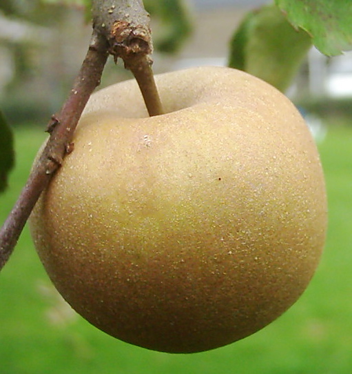
The apple is from my orchard. The variety is called Reinette Grise. Of the many different apples I chose that one, because this late ripening, hard variety has a reddish brown hue, as though there is a light sprinkle of ruffled dust which covers up the waxy light green skin underneath.
Next step is to enhance the 'golden effect'. I used Tinted Image fill option which ads coloured filter, more or less opaque, to the whole of the box, covering both photo and text. This was tricky - with filter too thick, the text becomes fuzzy, with the filter too transparent, the golden effect is lost. By readjusting the tinted colour opacity I achieved what looked like a golden tint.
back to Text Inspector
Now back to Text Inspector to adjust Inset Margin. I set it to zero to allow the picture merge with the box frame. This however brings the text too close to the edges of the box, but this can be avoided simply by adding spaces or increasing text indent in Tabs drop-down menu in Text Inspector.
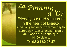
So this is how the final, client approved ad looked like.
If you developed your own technique of designing ads in Pages I would like to hear very much.

No comments:
Post a Comment